Overview
Lomotif is a leading social video editing app with a massive global user base. As a Senior Product Designer, I led key UI/UX improvements to enhance user engagement, streamline the editing experience, and drive retention.
The Challenge
📍 Complex Editing Experience - Users found the editing interface unintuitive, leading to incomplete video creations.
📍 Low Completion Rate - Only about 58% of users finished their video projects, suggesting the editor was overwhelming and lacked clear progress cues.
My Role & Design Process
As the Senior Product Designer, I collaborated with product managers, engineers, Data analyst and UX researchers to overhaul the editing experience and address key pain points. My approach followed a standard Design Thinking framework:
1️⃣ Research & Discovery
To ensure design decisions were data-driven, I conducted:
- 📊 UX Audits: Analyzed the current app’s UI complexity, navigation bottlenecks, and usability gaps.
- 🗣️ User Research: Interviewed new and active users to uncover frustrations and unmet needs.
- 🔍 Competitive Benchmarking: Studied TikTok and Instagram to identify best practices.
- 📈 Behavior Analytics: Used data insights to pinpoint where users abandoned the editing process.
2️⃣ Ideation & Prototyping
With a deep understanding of the pain points, I worked on:
- ✏️ Wireframing & User Flows: Crafted simplified editing workflows that reduced cognitive load.
- 🎨 UI & Interaction Design: Designed a cleaner, more intuitive editing interface using Figma.
- 🔄 Interactive Prototypes: Created clickable prototypes to simulate new interactions before development.
3️⃣ User Testing & Validation
- ✅ Conducted A/B testing to measure engagement before & after UI changes.
- 🎥 Live Usability Tests to validate whether new users could complete a video without confusion.
- 🔄 Iterated based on user feedback to refine micro-interactions and transitions.
Our Target
We set these target numbers collaboratively with the PM and data team. In previous experiments, we noticed that UX improvements typically reduced video creation drop off by around 3% - 5%. With that in mind, we set video creation as our north star goal at 35% and below, a number that felt achievable within a single release cycle. It gave the team a clear, data informed target while keeping the focus on creating a smoother, more motivating video creation experience for new users.
Understanding the Whys
Before exploring solutions, it was crucial to identify the root causes of the issue. Our data scientist analyzed user drop-off points and pinpointed the screens where users spent the most time, helping us uncover key usability challenges.
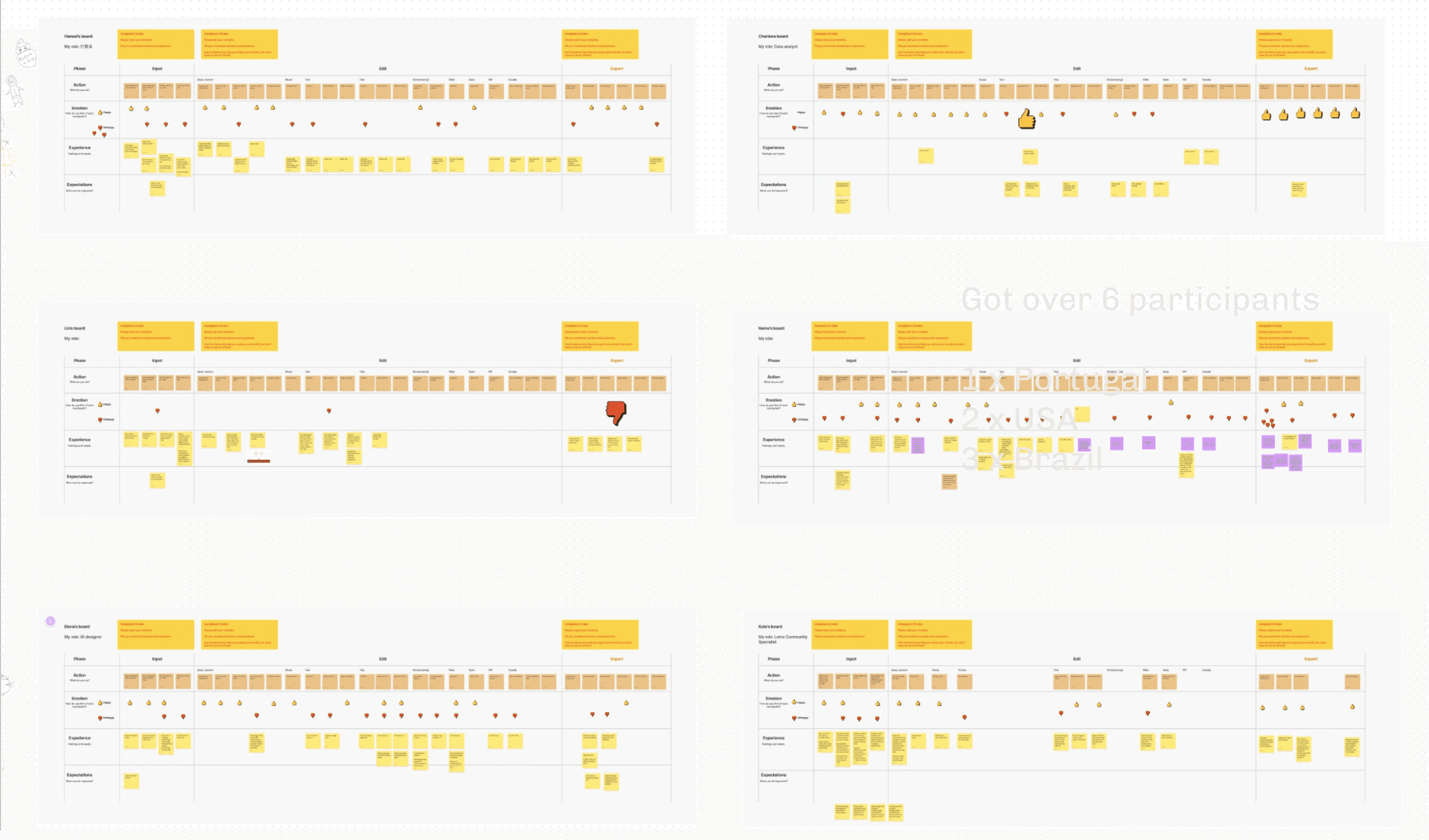
To gain deeper insights, we collaborated with our UX researcher and conducted a remote workshop with key stakeholders. This session helped us identify areas for improvement and establish a clear direction for enhancing the video editor. Due to remote working and our globally distributed team, we facilitated the workshop via FigJam, ensuring seamless collaboration despite geographical constraints.
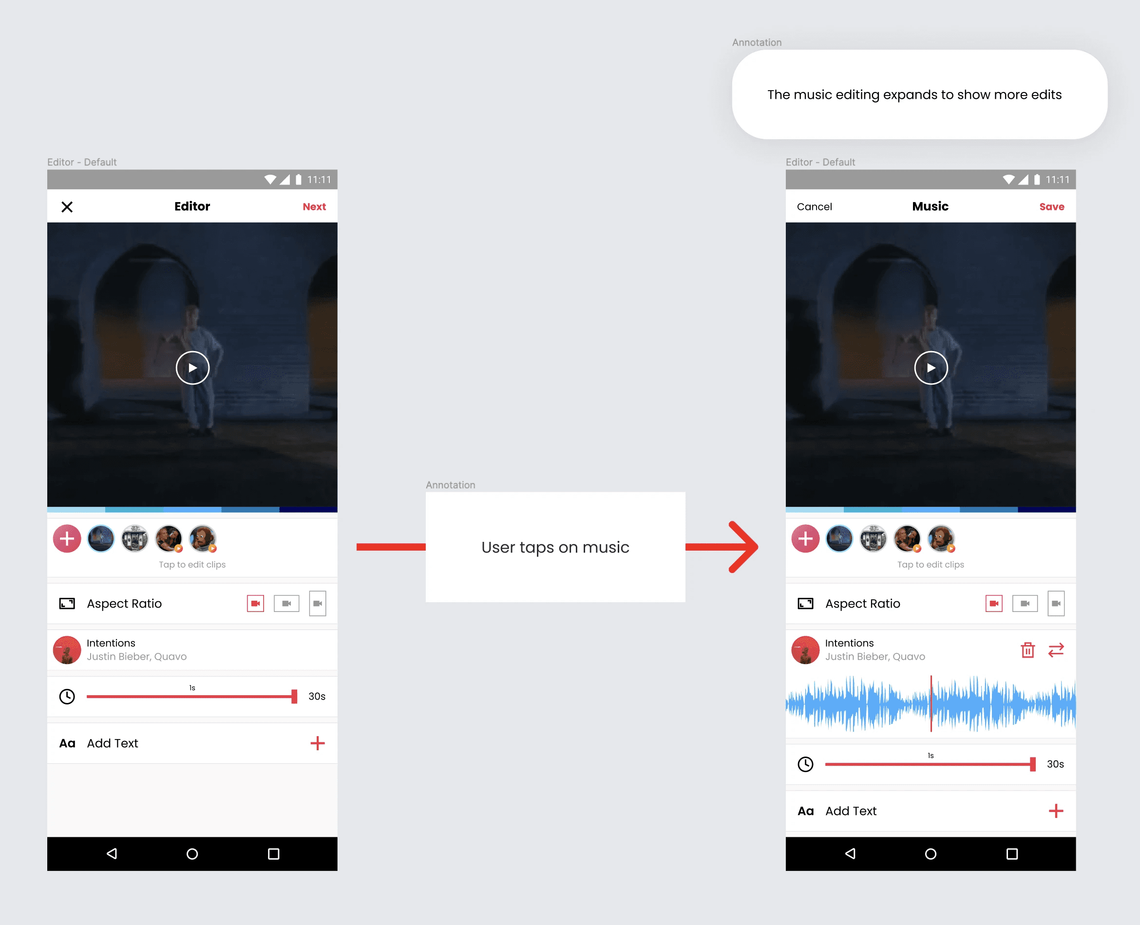
A major usability issue we observed during testing is that after selecting an editing tool, such as “Edit Music,” users assume that their changes are automatically applied, since other tools remain visible on the same screen. The “Done” button, which is meant to confirm their selection, is often overlooked due to its placement in the upper header, making it less intuitive.
Let me show this further:
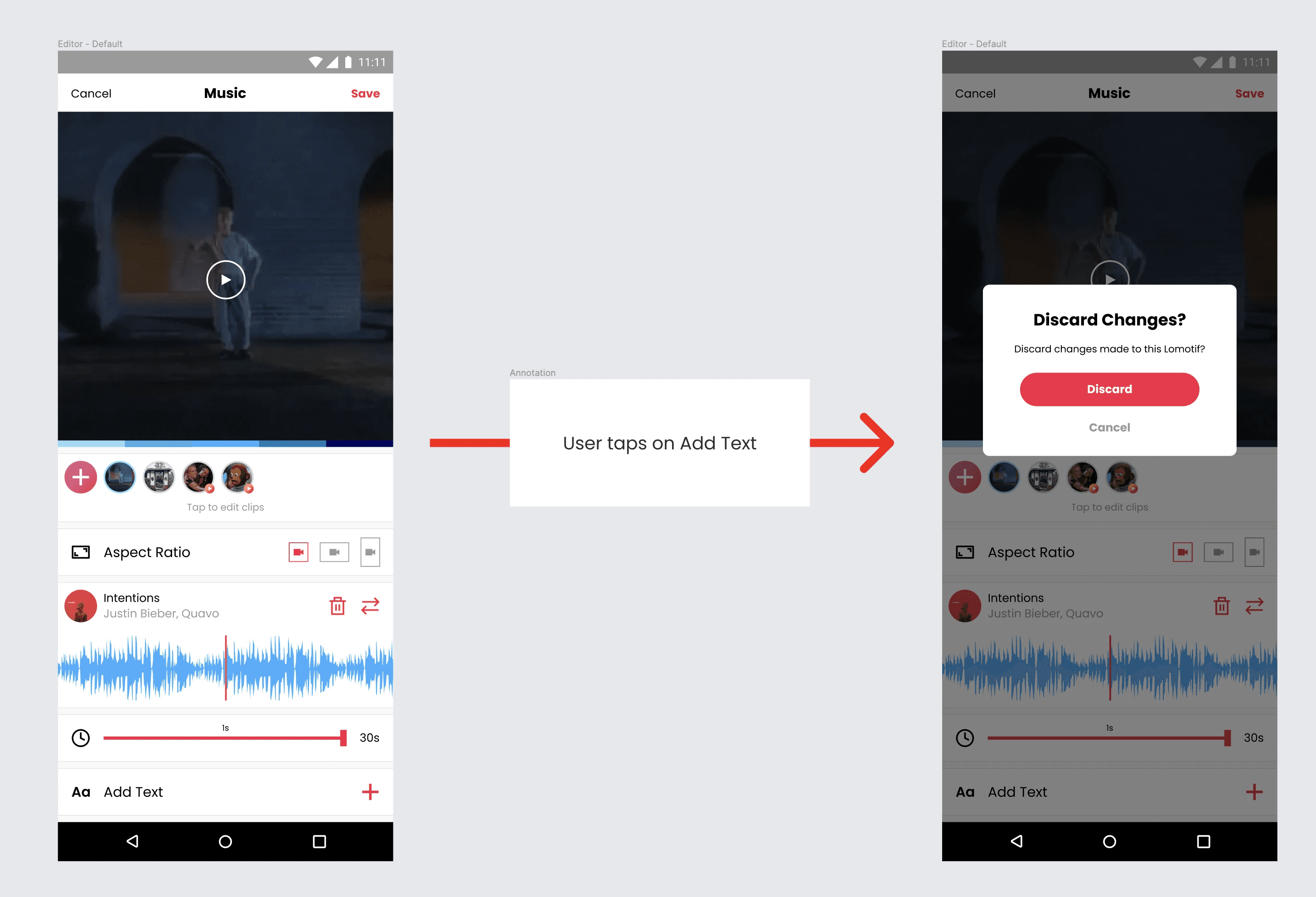
Put yourself in the user's position: having completed your edits and wishing to add text, instinctively, you would tap “Add Text” right away, but then this happens:
Imagine this occurring with every editing choice made by users; dissatisfaction leads to a substantial dropout rate. It's clear that we need to improve this procedure. Below is the visual representation of our user testing findings, highlighting where they abandon the creation flow.
Competitor Research
As short video platforms such as TikTok and Instagram are popular, I didn't want to reinvent the wheel. I conducted research on competing video editing apps to identify current trends and interaction paradigms.

TikTok
TikTok is one of the most recognized short video platforms. Its video editor opens directly to the camera, encouraging users to start recording immediately. Once recording is complete, the app seamlessly transitions to the editing interface, where most tools are conveniently positioned within the lower navigation panel. This layout enhances tool accessibility, ensures easy differentiation, and maintains a clutter-free interface, allowing for a more intuitive editing experience.
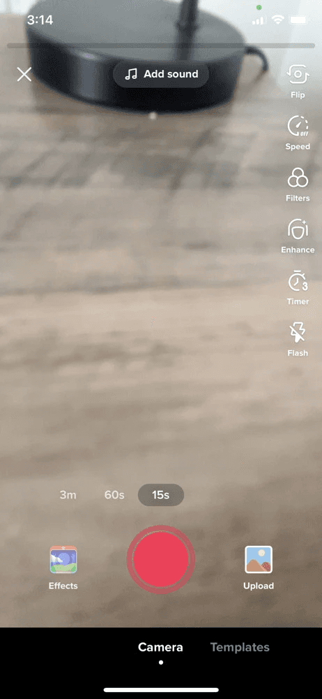
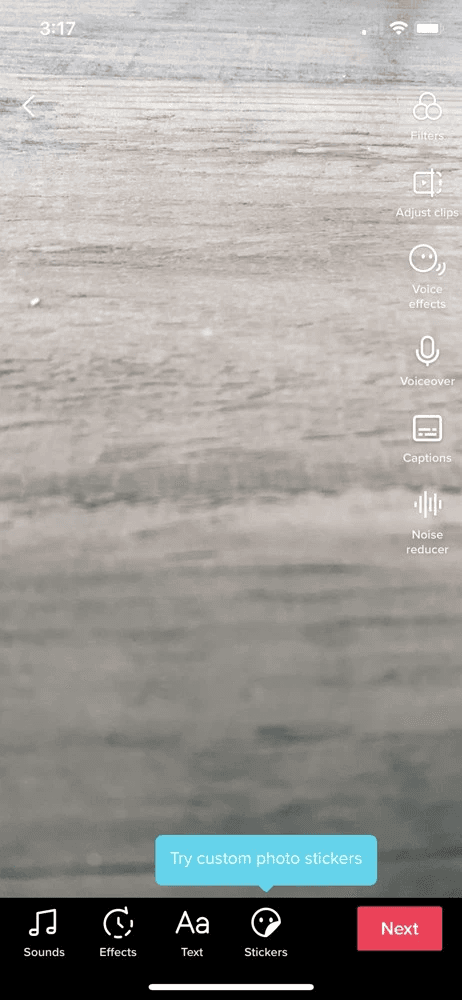
✅ Strengths:
- Seamless Entry into Creation - Direct access to the camera removes friction.
- Intuitive Editing Workflow - Smooth transition from recording to editing.
- Lower Navigation Panel for Tools - Keeps tools accessible and prevents cognitive overload.
❌ Weaknesses:
- Limited Pre-recorded Video Editing - Priority on real-time recording.
- Potential Overwhelm - New users feel rushed to record instantly.
- Lack of Multi-Clip Editing - Trim and transitions are relatively rigid.

Instagram follows a similar approach, guiding users directly into video recording before transitioning to the editing phase. The Instagram video editor prioritizes visual styling, allowing users to effortlessly navigate and explore available tools. Its interface features intuitive controls for essential functions such as trimming, applying filters, adding music/text, and organizing clips, ensuring a seamless editing experience.
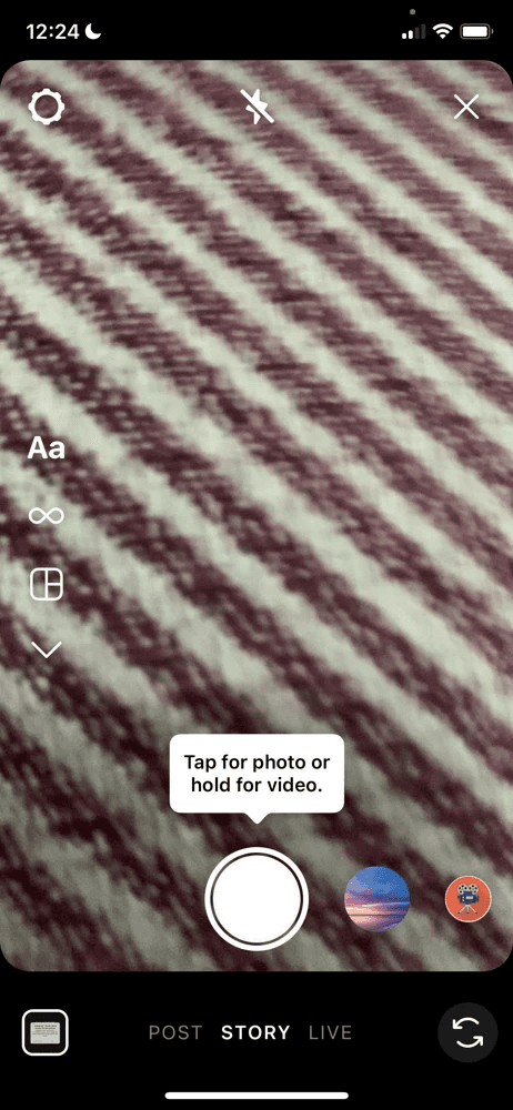
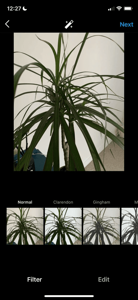
✅ Strengths:
- Advanced Clip Management - Better clip organization and reordering.
- Polished Aesthetic Tools - Emphasizes high-quality styling and filters.
❌ Weaknesses:
- Tools Nested in Menus - TikTok's tool strip is cleaner; Instagram requires extra taps.
- Stories/Reels Focus - Built around quick posts rather than a pure editing sandbox.
Summarize
Unlike TikTok and Instagram, where content creation starts with real-time recording, Lomotif caters to users who edit and compile pre-recorded videos, making its workflow more flexible for refining existing footage. That said, adopting their clean and intuitive editing tool arrangement improves usability, ensuring a seamless and user-friendly experience.
Wireframing
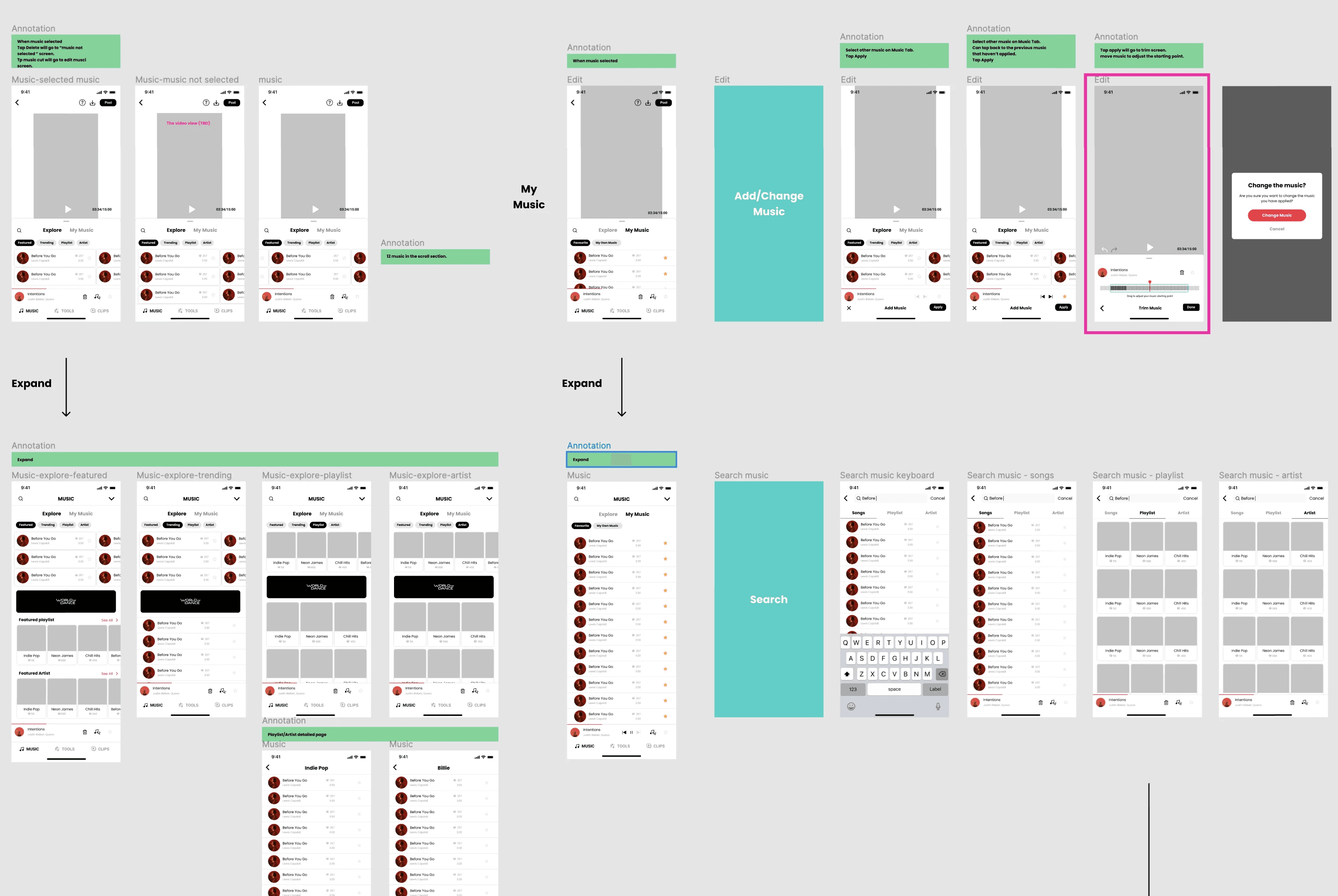
Throughout the wireframing stage, we explored multiple flow variations, with each team member contributing insights and feedback. This collaborative approach allowed us to refine the structure, ensuring a seamless and intuitive user experience.
Solution
After extensive testing and design iterations, we selected the optimized variant shown below. Our goal was to create a focused and distraction-free editing experience by guiding users to complete one task at a time.
- ✅ Task-Focused Workflow – Users can now fully engage with a single editing tool at a time, reducing cognitive load.
- ✅ Eliminating Accidental Actions – Prevents users from unintentionally interacting with other features while editing.
- ✅ Improved Navigation Clarity – A more intuitive layout ensures users can efficiently complete their edits before moving to the next step.
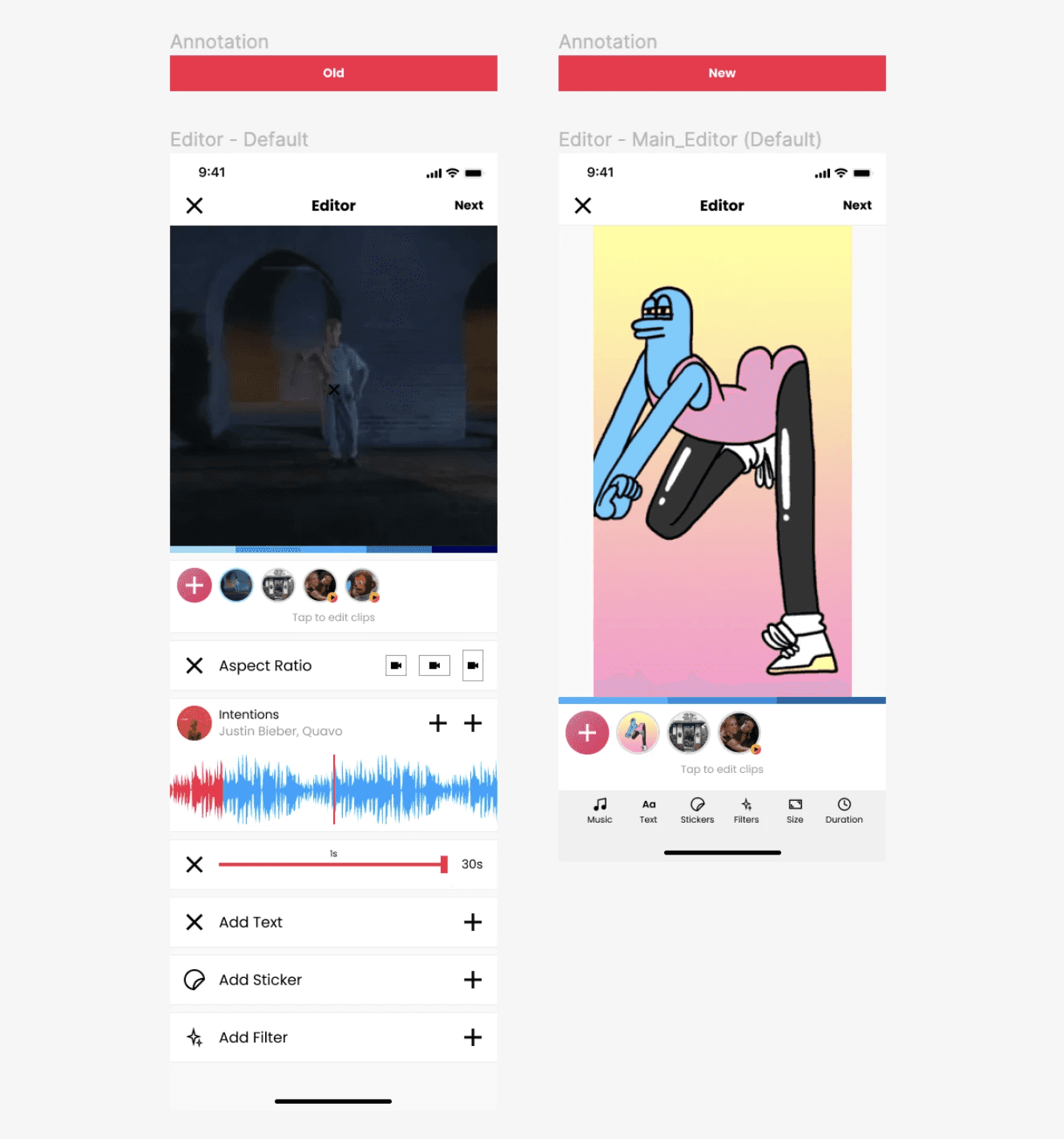
To enhance usability and visual clarity, I repositioned the tool icons to the bottom, providing users with a clearer overview of available tools. This adjustment also maximizes screen space for the video preview, aligning with user preferences for a more immersive editing experience.
Additionally, I changed the header color to black, creating a strong visual indicator that users have switched from the main editor screen to a specific editing tool mode. This subtle yet effective change improves contextual awareness, reducing confusion when navigating between different editing stages.
To maintain workflow consistency, all call-to-action (CTA) elements remain positioned at the bottom, where users’ attention naturally gravitates. This placement enhances efficiency, reduces cognitive load, and ensures a seamless editing flow.
Rather than redesigning UI elements from scratch, I leveraged the existing design system, ensuring consistency with established buttons, icons, and interaction patterns. This approach not only preserved brand familiarity but also streamlined development, allowing for faster implementation without disrupting the user experience.

Interactive Design Simulator
To further validate the improvements, our UX researcher conducted usability testing via Zoom with 5–10 global users. Each participant interacted with a high-fidelity prototype. Below, you can explore the exact states of the redesigned editor and compare them to the legacy layout:
Legacy Interface: The 'save' action was hidden in the upper header, while other active tools remained visible, tricking users into selecting new tools without saving.
Interaction Friction: Because users missed the Done button, tapping a new tool triggered this frustrating alert warning, disrupting their creation flow.
Redesigned Flow: Focuses the screen entirely on a single tool. Repositioned CTAs and tool icons to the bottom bar, with a black header emphasizing the focused mode.
Final Specs & Design Tokens: Detailed view of spacing rules, icons, and buttons constructed utilizing Lomotif's existing UI design system guidelines.
Deploy
A/B Testing Approach: Due to the short project timeline, we needed a fast and reliable way to measure the impact of our design changes. Instead of conducting long-term observational studies, we opted for a controlled A/B test, a widely used method for quickly validating UX improvements at scale. In this test, 50% of users experienced the redesigned editor, while the remaining half continued using the existing version. This allowed us to directly compare engagement rates and feature adoption between both groups.
Result
While we didn’t fully hit our stretch goals, each result revealed valuable insights, indicating clear evidence of progress, showing that simplifying the editor and clarifying the user journey measurably improved creation success.
💡 Key Takeaways
This project reminded me that KPIs aren’t grades they’re learning instruments that help teams uncover what truly drives user behavior.
While we didn’t fully hit our stretch goals, each result revealed valuable insights: we reduced drop-off from 42% to 38%, improved completion by 8%, and achieved a +1.3% engagement lift within a short test window. Rather than seeing it as a shortfall, we treated the outcome as evidence of progress, proof that simplifying the editor and clarifying the user journey measurably improved creation success. These learnings shaped our next iteration strategy and informed how we measured impact moving forward.
🚀 Presenting Findings & Launch Decision
After analyzing the A/B testing results, me and the product manager presented the findings to the team and key stakeholders to gather additional feedback. The discussion helped align on the effectiveness of the improvements, and after weighing the data and qualitative insights, we collectively decided to proceed with a full rollout.
🧭 Next Steps
- 🔹 Further Refinements – Deep-dive into user session data to identify the moments where creators hesitate or abandon projects.
- 🔹 Iterative Testing – Run follow-up A/B experiments focusing on micro-interactions and discovery patterns to close the final performance gap.
- 🔹 Long-Term Monitoring – Track engagement and retention trends to validate sustained impact after full rollout.